Yo future astronauts!
Our game needed a new opening image. I wasn't fully satisfied with the old one since it didn't properly portray the things I had intended. So first things first, I had to come up with some idea for the picture. Something that would describe the game and feel exciting as the first thing the player sees. Maybe it could be somewhat funny, or outlandish?
I thought to myself; Okay, the game is about flying in space, punching aliens to death and blowing up asteroids, how the heck am' I gonna fit all those themes in a picture that's easily understood? I tried to think whether one of those aspects was more important than the other, but choosing one made me feel like I was leaving out something important.
After a bit of aimless searching for inspiration I ended up looking at pictures of old SNES game box art. I had always thought those were really captivating with their details, colors and action, as crazy as some look today =D Many of them seemed to follow the same concept, they had the huge bulging hero in the front and a wave of evil goons charging at him from further back. This really makes sense and it works. You want to hype and show people; "This is your hero, look how swoll he is, he's afraid of nothing. Wanna be this guy?".
This kinda box art is delightfully retro to me and I kinda wanted something similar for our game.
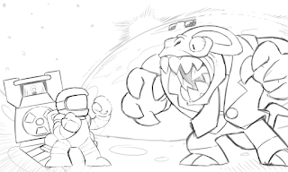
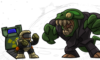
On the contrary, I never saw the player characters in our game, the astronauts, as your typical Arnold Musclebags. I felt like behind the helmet was your average Joe, some poor unlucky bastard who doesn't care about being a hero, but who also can't turn down a good fight =P These guys are just unlucky victims of their situation and they're awfully outmatched against the aliens. So instead, I decided to have a tiny, but feisty, astronaut being overshadowed by a horrible reptilian alien. A perfect example of their situation and an iconic demise of many of them, as alien chewtoys. Here's a quick first sketch based on this:
 |
| Sketch |
I remember there was some secret rule out there about placing characters into a picture. Usually the hero is on the left, and the bad guy is on the right if they're facing eachother. This doesn't always seem to be the case though, looking at some of the boxes. If someone knows what I'm talking about and has a cool link that talks about this, please share. I'd appreciate it =)
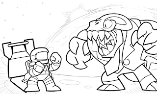
Next up was lineart. I utilize thick outlines, and as a rule of thumb; the closer an object is the thicker the outlines. Backgrounds don't usually have lineart though I'm not always consistent with that. I usually keep the lineart in the topmost layer:
 |
| Lineart |
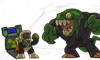
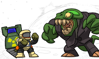
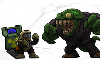
Next up are flat colors, or "flats". I keep them in the lowest layer and just carefully fill in the areas manually. It's how I like to work:
 |
| Color |
Next are shadows. Since I have a "cellshaded" style I handle them with a single solid color, and adjust the layer's opacity to something nice. I try to think of where the light source is located and draw the borders of the shadows according to shapes of the objects, then fill up the rest. If there are multiple sources I make separate individual shadow layers. Here there's a strong light source behind the characters (the sun) and another weaker one to the front and up. I usually put the shadow layer right under the lineart:
 |
| Background light shadows |
|
 |
| Top down light shadows |
| |
 |
| Combination result |
Some years ago I learned that having an extra gradient shading layer for your characters helps them blend in the surroundings a little better. I've kept this method and use it here with the reptilian, the astronaut and the drill. You can see how they get darker towards their feet, although without a coloured background you can't really tell the difference yet. I place the ambient layer below the shadow layers:
 |
| Ambient shadow layer |
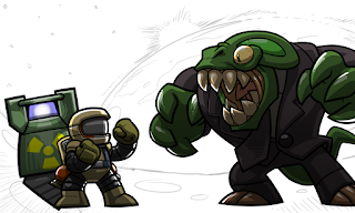
Since I'm just using white light here I'm making another layer for white highlights; places where the light would reflect the most intense. I'm also trying to think which surfaces would reflect light, like metal and claws and stuff. Since I have two light sources I also make two light layers, one more intense than the other. I place the light layers under the shadow layers since sometimes some light in the darkness is nice:
 |
| Lights |
I decided to keep the background from the old picture, since I felt it was suitably spacey and had a nice angle already. I just added some more stones to the ground to give it more texture. I also added in a title I had made previously.
Here's a side by side comparison between the old and new title cards. Overall I'm pretty happy with the new one. I think it better shows some major things like the bomb drilling and fighting while still being very spacey. It's a lot spookier than the old one too =D
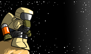
I still wanted to incorporate the Lander game aspect in the game's opening somehow. Luckily there was an easy way to do this since the camera just pans up to the menu screen from here, making the title and the menu one BIG picture that could tell a story of sorts. That meant that I could fairly easily incorporate the lander ship in the main menu screen. I decided to just try and update the current main menu background so that the astronaut here would be sitting on a lander ship instead of on a rock =P But that's probably a story for another time.
 |
| Menu screen |


